View Types
Pick how each portal table is displayed to end users: table, gallery, kanban, calendar, or FAQ. Each view has its own configuration.
Overview
Every table in a portal can be displayed in one of five layouts. The right choice depends on the shape of the data and what end users need to do with it. Pick the view per page, in the portal admin, and give a table a second page if you want it shown two ways.
| View | Best for |
|---|---|
| Table | Tables with many fields, structured data, lists where columns matter |
| Gallery | Anything with a visual hook: properties, products, people, portfolio items |
| Kanban | Workflows with stages: tickets, applications, candidates, content production |
| Calendar | Anything placed on a date: bookings, events, deadlines, schedules. Switch between month, week and list views. |
| FAQ | Anything read rather than worked with: help centers, policies, onboarding guides, terms |
Picking a View Type
- 1
Open the table settings
In the portal admin, open the role you want to configure and open the page you want to change.
- 2
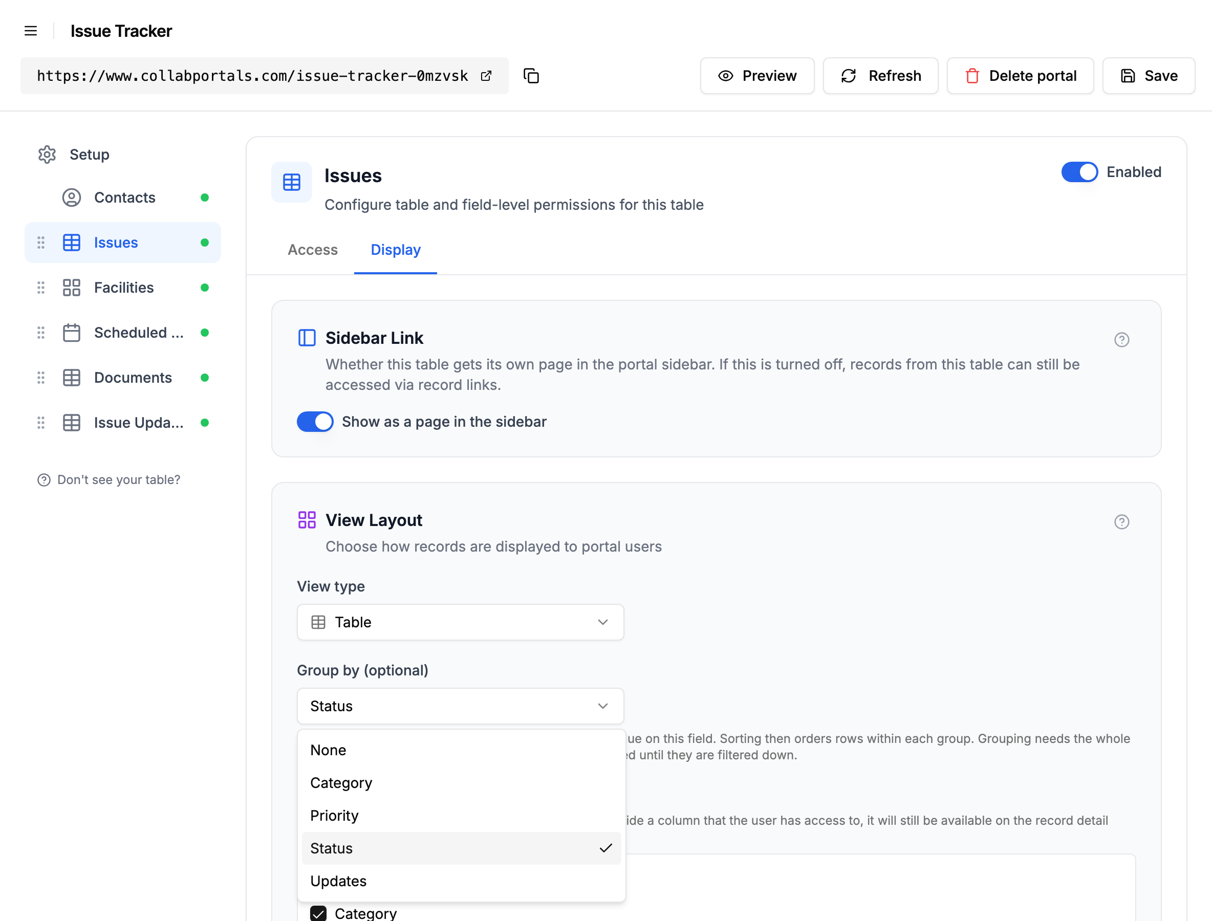
Switch to the Display tab
A page has four tabs: Access (table permissions, record visibility, record filtering), Fields (field permissions, field order and related tabs), Display (view type, field selection, grouping, default sort and the end-user controls) and Labels (that page's own wording). Click Display.
- 3
Pick a view type
Use the View type dropdown to pick Table, Gallery, Kanban, Calendar, or FAQ. The fields below the dropdown change depending on what the view needs.
Requirements per View Type
Each view (other than Table) needs a specific field type to be present on the Airtable table. The dropdown disables options when the required field is missing.
- Gallery: any field type works as the card body. An attachment field is optional, used as the cover image.
- Kanban: requires at least one single-select field to group records into columns.
- Calendar: requires at least one date or dateTime field to place records on the calendar.
- FAQ: requires a viewable text field for the question and a different one for the answer. The answer takes single line text, long text, rich text, AI text, and formulas, rollups or lookups resolving to one of those; the question is narrower, taking single line text, long text, and formulas or rollups resolving to one of those, because it is printed as a plain heading.
- Table: no field requirements.
If you want to use Kanban, Calendar or FAQ but the table is missing the required field, add it in Airtable first.
Grouping Rows in the Table View
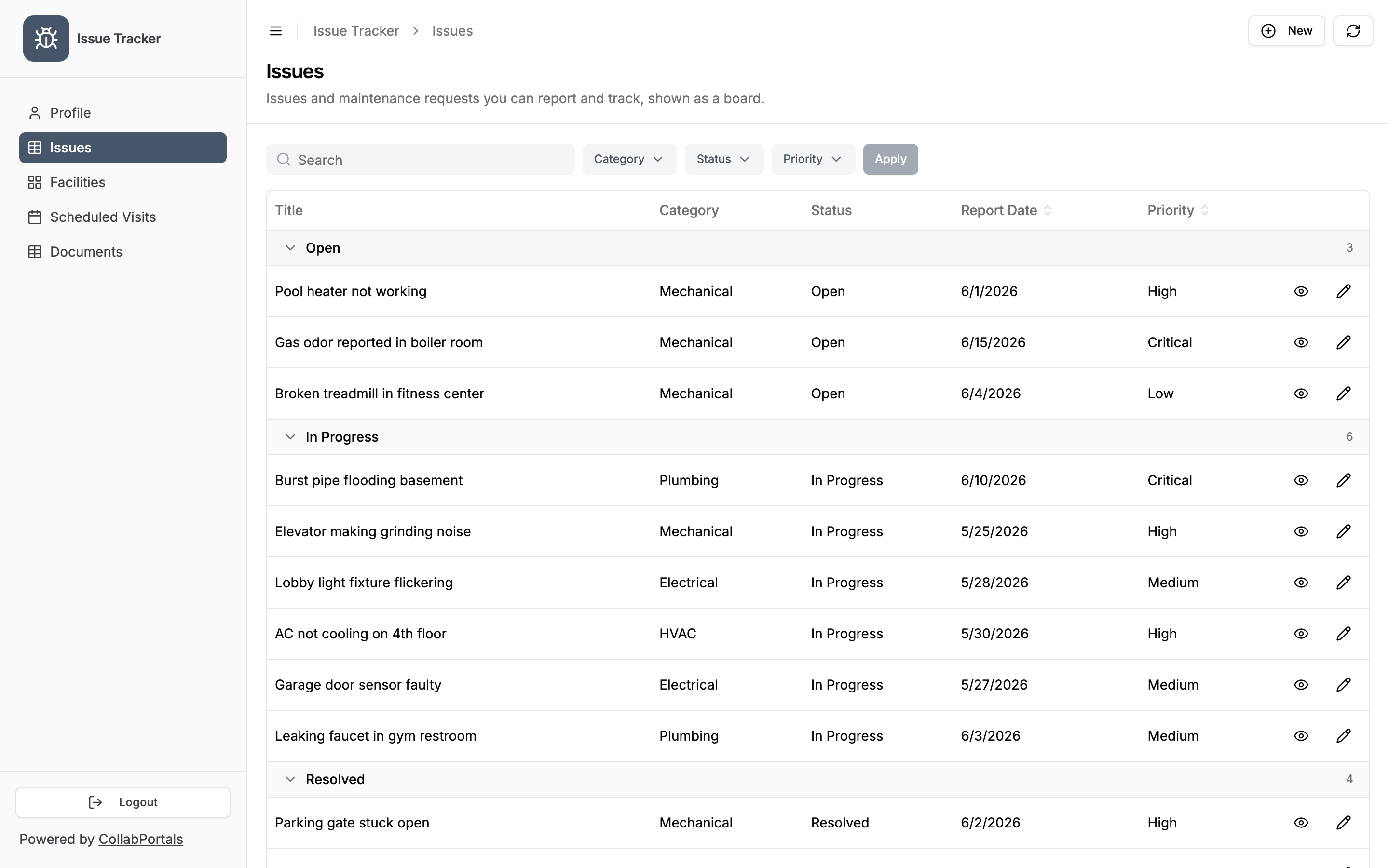
The table view can group rows under collapsible headers, one per value of a field you pick, the same way Airtable's grid does. Each header shows how many records are in that group, and records with no value collect under a "No value" group at the top.
Set it with the Group by dropdown in the Display tab, which appears when the view type is Table. You can group by a single select, multiple select, checkbox, single collaborator, linked record, sync source, date, or date and time field, and by a lookup that pulls one of a select, a linked record or a sync source across a link. Only fields the role can view are offered, since grouping prints a field's values in the headers. Number and text fields are not offered: they produce too many groups to be useful, and a multiple-collaborator field cannot group either.
End users see the records under collapsible headers, one per value, each with an exact count.
A few things worth knowing:
- Sorting still applies inside each group. Grouping decides the blocks, sorting orders the rows within them. It never changes the order of the blocks.
- The group order does not depend on how many records are in each group. A select or sync source column keeps the option order Airtable holds for it, and a lookup of one keeps that column's order too. A checkbox puts unchecked first, and has no "No value" group at all: an empty cell and an unticked one are the same thing in Airtable, so both land under Unchecked. Where a field carries no options at all, a linked record or a collaborator, there is no order to follow and the groups come out alphabetically. On every other field type, records with no value group first.
- Multi-value cells group by the whole combination. A record tagged "Design, Urgent" sits in its own group rather than appearing under both, so every record is counted exactly once and the group counts always add up. Those combination groups sort after all the single-value ones: "Design, Urgent" matches no single option name, so it has no place in the option order and lands with the alphabetical remainder.
- Date fields group by day, week, month or year. Pick a date field and a Group dates by dropdown appears under it, set to Month to start with. Grouping by month on an invoice date gives one group per month, "September 2026", "October 2026" and so on, oldest first. Weeks start on Sunday, matching the calendar view, and are headed "Week of" the Sunday's date. A date and time field is grouped in the time zone set on the field in Airtable. If the field has no time zone set, each person sees it grouped in their own time zone, so a record from 11pm on the 30th sits in that month for someone in the same zone. If you let people choose the grouping themselves, they get a Day, Week, Month and Year switch beside the picker.
- Groups can start closed. Tick Start groups collapsed, under the Group by dropdown, and people see the headers and their counts first, then open the groups they want. It is worth turning on when the groups are long, or when most people only care about one of them. Either way anyone can collapse and expand any group as they read.
- Grouping needs the whole table at once. Counting a group means having every matching record, so the portal loads them all rather than one page at a time. Above 500 records it stops and shows the table ungrouped with normal pagination, along with a note explaining why. Nothing is hidden, and filtering the table down brings the grouping back.
To let people choose the grouping themselves rather than fixing it, see Filter and Sort Controls.
The FAQ View
The FAQ view renders a table as an accordion: the question field becomes the heading, and the answer field becomes the panel that opens under it. It is the layout for the tables people read rather than work with, where a table row clips the long answer after two lines, cutting off the part the reader actually wanted.
Set it with the Question field and Answer field dropdowns in the Display tab, which appear when the view type is FAQ. A third setting, Start answers expanded, decides whether the page opens as a list of questions or with every answer already open. Either way a reader can open and close whatever they like, and more than one answer can be open at once.
An FAQ loads the whole table rather than a page at a time, so nothing is one Next button away from being read as unanswered. Like the kanban and calendar views it stops at 500 records, and unlike the grouped table view it does not say so, which is why a table of that size wants a record filter on it.
See FAQ View for the full reference, and turning a table into an FAQ page for a worked example.
What Lives on the Row vs the Detail Page
The table, gallery, kanban and calendar views share the same idea: the row, card, or calendar entry shows a curated summary of the record, and clicking it opens a dedicated detail page with everything else. You choose which fields appear on the summary in the Display tab. The FAQ view is the exception, and has no summary-field picker: its two fields are the question and the answer. See Summary Fields and Record Detail for the full reference.
This matters most on wide tables. A table with 100 columns is unreadable as a row. Pick five or six summary fields, let the rest live on the detail page, and users get a clean list plus the full record one click away.
Per-Role Configuration
View type is configured per role. Different roles in the same portal can see the same page as different layouts, for example a kanban for the ops team and a gallery for clients.
To give the same role two layouts of one table, add a second page on it. Each page has its own view type.
Next Steps
- Summary Fields and Record Detail - Pick which fields show on the row or card
- Gallery View - Cover image and card fields
- Kanban View - Group field and drag-to-edit
- Calendar View - Date field and calendar behaviour
- FAQ View - Question and answer fields, and whether answers start open
- Field Permissions - Control field-level visibility, and the four fields a layout shows whatever their permissions
- Landing Page - A table's view type sets its card icon on the navigation landing page
- Filter & Sort Controls - Let users filter, search and sort whichever view a table uses
- Related Tabs and Nested Tables - A related tab inherits the child table's view type