Landing Page
Choose what end users see first when they open your portal: a home page with your own welcome text and a card for each page, the profile page, or a specific page.
Overview
The landing page is the first thing an end user sees when they open your portal. You choose it in the Design tab of a portal's settings.
There are three options:
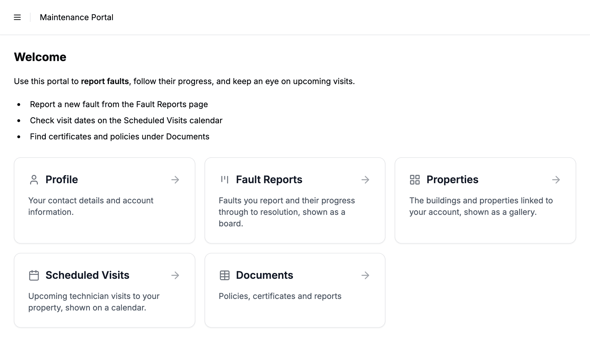
- Home page is your own description followed by a grid of cards, one for each page the user can reach. Each card shows the page name, an icon for its view type, and a short description. This is the default for new portals.
- Profile opens straight to the logged-in user's own record. This was the original behavior, and it is what every portal created before this feature stays on.
- A specific page opens straight to one of your portal's pages, in whatever view type that page uses. If a table has more than one page, each of them is offered, so you can land people on any of them.
Choosing the Landing Page
- 1
Open the Design tab
From your admin dashboard, open the portal you want to change and switch to the Design tab of its settings.
- 2
Pick a landing page
In the Landing page dropdown, choose Home page, Profile, or one of your pages. Each page is listed by its name and carries its icon, and Profile shows a person icon. An embed page can be the landing page too: a user who does not see it, because a role has it turned off or their profile has no address for it, lands on the home page instead.
- 3
Save the portal
Save the form. The next time an end user opens the portal, they land on the page you picked.
The Home Page
The home page is a launcher. It shows a card for every page a user can open: their profile, plus each page whose table they have permission to view. A user never sees a card for a table they cannot access, because the cards follow the same permissions as the sidebar.
Each card uses the icon for that page's view type, so a table reads as a table, a gallery as a grid, a kanban as a board, and a calendar as a calendar. The card also shows the page's description, so users get a one-line explanation of what each page is for. Set it on the page's Labels tab, or leave it empty to use the table's description from Airtable.
The portal name sits in the sidebar header and in the breadcrumb at the top. The home page itself carries no title, so the first thing on it is your description, if you have set one (see below), and then the cards.
Portal Description
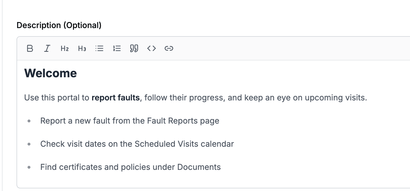
The Description field, also in the Design tab, is an optional block of text about the portal. When set, it shows on the home page below the header and above the cards. Use it to welcome people, say what the portal is for, or point at the page they most likely want.
It is a formatting editor, so you type and it looks the way it will look on the portal. The toolbar above the box covers headings, bold, italic, bulleted and numbered lists, quotes, inline code, and links. Markdown shortcuts work too if you prefer them: start a line with ## for a heading or - for a list item, or wrap a word in ** for bold.
Links open in a new tab, and only web addresses and email links (https://, http://, mailto:) are accepted.
HTML is shown as text rather than rendered.
If you already had a description, it carries over as it was. Two things to know: an asterisk either side of a word, like *this*, now italicises it, and a description written across several lines now keeps those line breaks instead of running them together.
The description only appears on the home page. If your landing page is the profile or a single page, the Description field is hidden in the Design tab, because there would be nowhere to show it. Anything you had written is kept, and comes back if you switch the landing page back.
When the Landing Page Is Out of Reach
The landing page is one setting for the whole portal, but what each person can see depends on their role. Anyone whose role cannot view the chosen page lands on the home page instead of an error, and the Design tab warns you which roles that affects when you pick it.
If you delete the page that is your landing page, the portal goes back to the home page.
Defaults and Existing Portals
- New portals default to the Home page.
- Existing portals stay on the Profile page, so nothing changes for portals you already share. Switch them to Home page in the Design tab whenever you want.
Next Steps
- Portal Pages - Add pages, including a second page on one table
- View Types - The view type of each page sets its card icon on the home page
- Portal Branding - Logo, colors, and favicon, also in the Design tab
- Role-Based Access Control - Which tables a user can see, and so which cards appear
- Sharing Your Portal - How end users first reach the portal