Filter & Sort Controls
Give portal users their own filter, search, and sort controls on a table. Configured per table and per role, applied server-side, and only ever narrows what the role can already see.
Overview
Filter and sort controls let the person looking at a portal table narrow it down themselves: filter by a field, search across text fields, and sort the results. They are configured per table (and per role) in the admin UI, and they apply on top of what the role is already allowed to see.
This is most useful once a role can see every record in a table. A directory of hundreds of contractors or a board of every open job is hard to use without a way to search and filter it down.
How It Relates to Other Filtering
These controls are end-user facing and optional. They are separate from the admin-side record filter, which is a fixed condition you set, and from record ownership, which limits a user to their own rows.
The controls always compose on top of those: they can only narrow the list further, never widen it. A user can never use them to see a record the role was not already allowed to see.
Enabling Them
- 1
Open the Display tab and turn the controls on
Open the table in the admin and go to the Display tab. Scroll down to the Filter & Sort Controls card and turn on Enable filter, search and sort. A layout picker and four field lists appear.
- 2
Choose which fields users can filter, sort and search
Pick the fields for each list. You are choosing what the controls offer, not changing what the role can see.
- Filter layout: where the controls sit on the page, a left sidebar or a row above the records. Leave it on Default to keep what each view type has always used: a sidebar for a gallery, a top row for everything else.
- Filterable fields: the fields users can filter on. Fields with a fixed set of values (single select, multiple select, rating, linked records, and the sync source column on a synced table) get a list of the values on that table. Number fields (number, currency, percent, count, auto number) get a min and max box instead. Date and date and time fields get a list of months, see Date fields below.
- Lookup fields are filterable when they pull through a select, a linked record or a sync source. Those get a list of values just like the original column does. Number and date lookups are not offered: number and date columns are filterable on their own, but neither a min and max box nor a month can be matched through a lookup. A lookup can hold several values on one record, so it always matches by "contains one of the values you picked", the way a multiple select does.
- Sortable fields: the fields users can sort by.
- Search fields: the text fields the search box looks through.
- Groupable fields: the fields users can group the table by. Leave every field unticked to keep the grouping you set under View Layout fixed. A date field can be grouped by day, week, month or year, and people switch between them beside the picker. Lookups can be grouped by on the same terms as filtering: a lookup of a single select, a multiple select or a linked record is offered, and a record holding several values is counted once, in a group named after the whole set.
Save the portal and the controls appear on that table's pages.
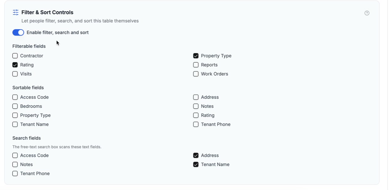
The Filter & Sort Controls card. Turn the controls on, then choose which fields are filterable, sortable and searchable.
What Users See
The same controls render in both layouts, sized to fit. Filters are staged as the user selects them and only take effect when they press Apply (or Enter in a box). For a single field, ticking several values matches any of them. Across different fields, all of the conditions must match. The current filters are reflected in the page URL, so a filtered view can be bookmarked or shared. Opening a record from the list and going back, with the back arrow or the browser's own back button, returns to the list with its filters still applied.
Which layout a table uses is up to you, under Filter layout. The two below are the defaults.
Gallery view
A filter panel runs down the left side with the search box, a section per filterable field, and a sort control.
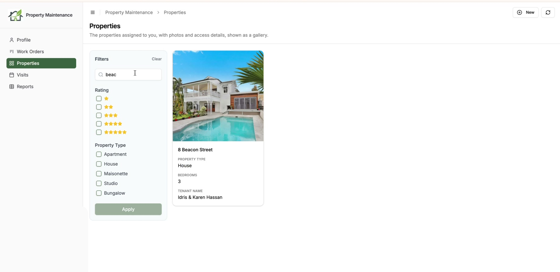
Table view
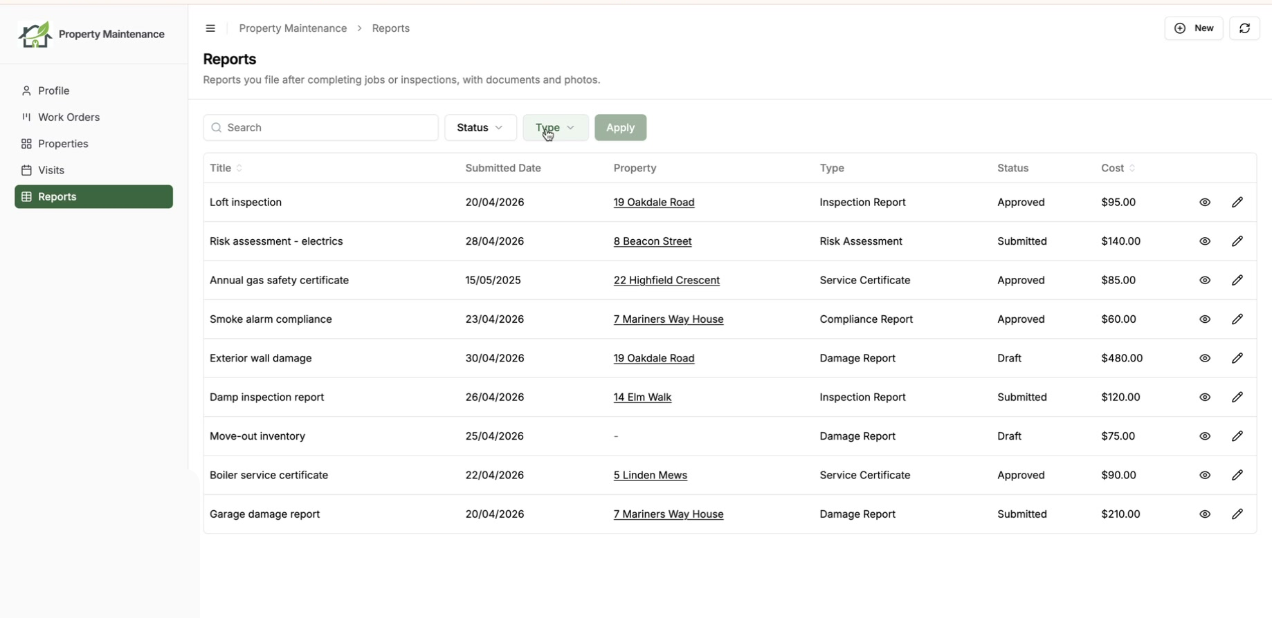
A toolbar sits above the table with the search box, a button per filterable field, and an Apply button. The Apply button counts what is waiting, so it reads "Apply 2 filters" once two values are ticked. Clicking a column header sorts the whole table.
On a table with enough filterable fields to fill the row, the buttons wrap onto a row of their own beneath them rather than being squeezed in beside the last one. With only a few filters they stay on the same row.
On narrow screens both layouts collapse to a single Filters button that opens the controls in a panel.
The sort control follows the view, not the layout. A table view is sorted from its column headers, so it has no separate sort control wherever its filters sit. A gallery has no headers, so its sort control travels with its filters.
Number fields
A filterable number field gets two boxes, a minimum and a maximum. Either one on its own is a valid filter: a minimum alone means "this much or more", a maximum alone means "this much or less". Both bounds are inclusive.
Under the boxes is the range that field covers across the records the person can see, so it is clear what there is to filter. It does not change as they page through the list or narrow it with other filters. On a table of more than 500 records the range is not shown at all, because it would be worked out from part of the table and could name a maximum well below the real one. The boxes still work; there is just no hint above them. Records with the field left empty are never matched by a number filter, including by a maximum: an empty cell is not a zero.
Percent fields are typed the way they read, so 50 means 50%.
Date fields
A filterable date or date and time field lists the months its records fall in, newest first, for example "October 2026", "September 2026". Tick one to see that month's records, or several to see all of them. It is built for things like monthly billing: tick September and the table shows every record dated in September.
A date and time field is matched in the time zone set on the field in Airtable. If the field has no time zone set, each person filters in their own time zone, so the September they pick is their September. Records with no date are never matched by a month.
Months are the only option for now. There is no day or custom date range filter.
Grouping
If you ticked any groupable fields, a Group by picker appears with the other controls, at the right of the toolbar's last row or as its own section in the sidebar. Unlike the filters it takes effect as soon as it is picked, with no Apply, because it only changes how the records already on screen are arranged. Picking No grouping turns it off even when you have set a default grouping under View Layout.
Grouping is table view only, and it needs the whole result set, so a table over 500 records shows ungrouped until it is filtered down. See View Types for the details.
Notes
- Filtering and sorting run server-side, so they stay correct across pages on large tables.
- Dates filter by calendar month only. A custom from and to range is not available, in these controls or in the admin record filter.
- Duration, formula and rollup fields cannot be given a number filter yet, even when they hold a number.
- A rating field shows as stars and can be filtered by the number of stars, rather than as a min and max.
- Kanban and calendar pages do not show these controls. They appear only where that table is a related tab on another record, inside the view's own control bar, so the layout choice does not apply to them.
Next Steps
- Record Filtering - Set a fixed, admin-side filter on a table
- Role-Based Access - Give each role its own tables, fields, and controls
- Default Sort - Choose how a table is sorted when it first loads